 Skip to content
Colour Theory
What makes this course different?
You might expect very experienced DOPs to have an innate colour sense and pick up grading very quickly. However, that hasn’t been my experience. It takes a lot of time for most people to train their eyes to see subtle colour casts. I teach different techniques to get you seeing like a colourist. And no matter how experienced you are, it’s still very easy to for your eyes to get tricked. We’ll explore different ways to combat this.
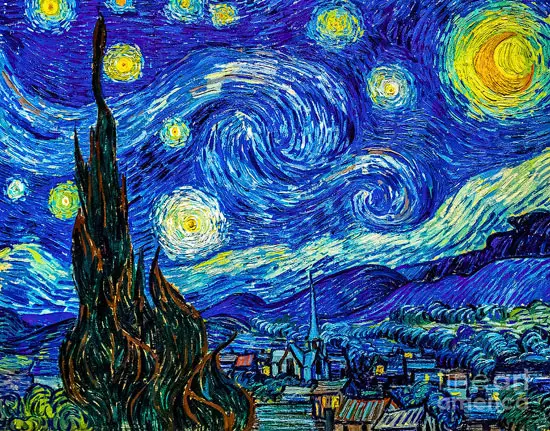
I’ll also teach you how to analyze colour from your favourite movies, so you can replicate distinctive looks in your own work. Take this example from the influential French film Amélie (2001).
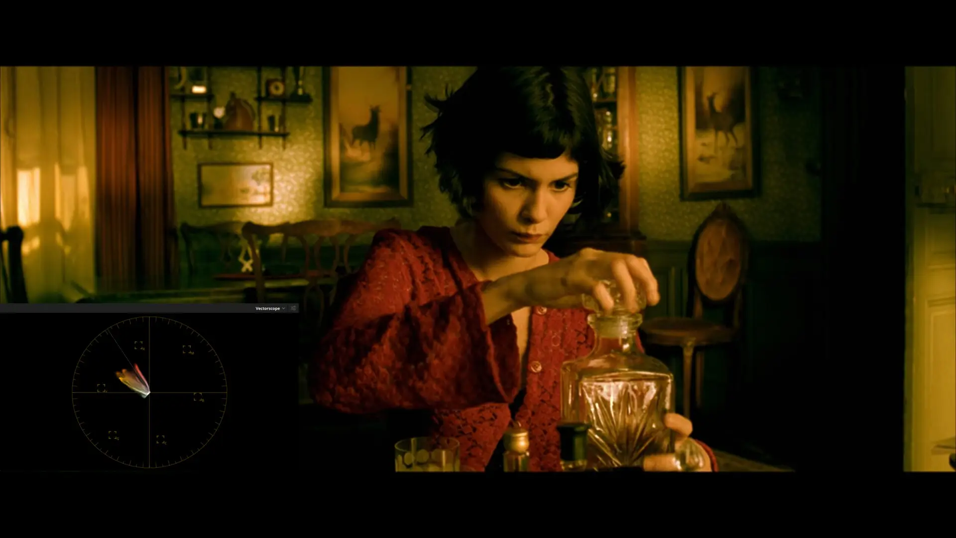
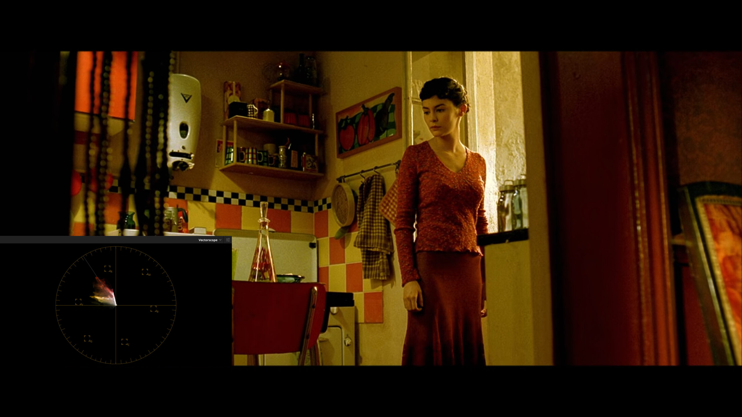
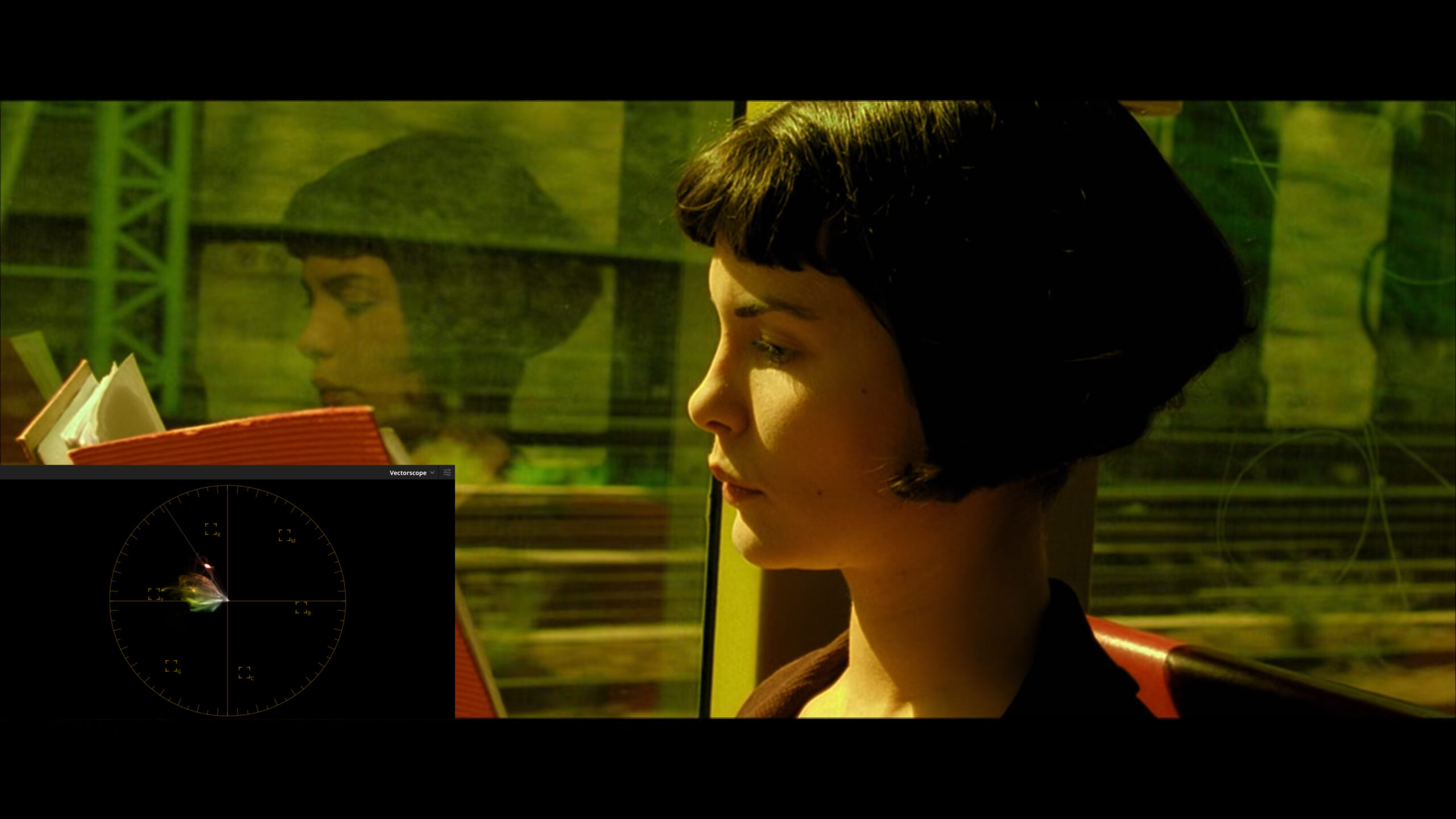
It’s a red, yellow and green colour palette. So, everything is stacked to the left side of the vectorscope. There’s a green tint through the blacks and a yellow wash over the rest of the image. When I worked in Mumbai I graded a TVC with a version of this look, which you can watch in my showreel.
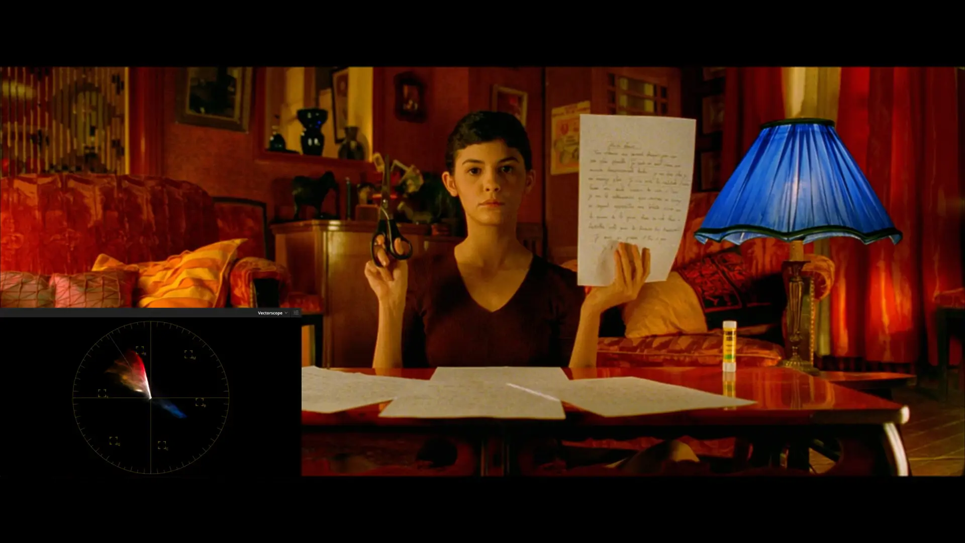

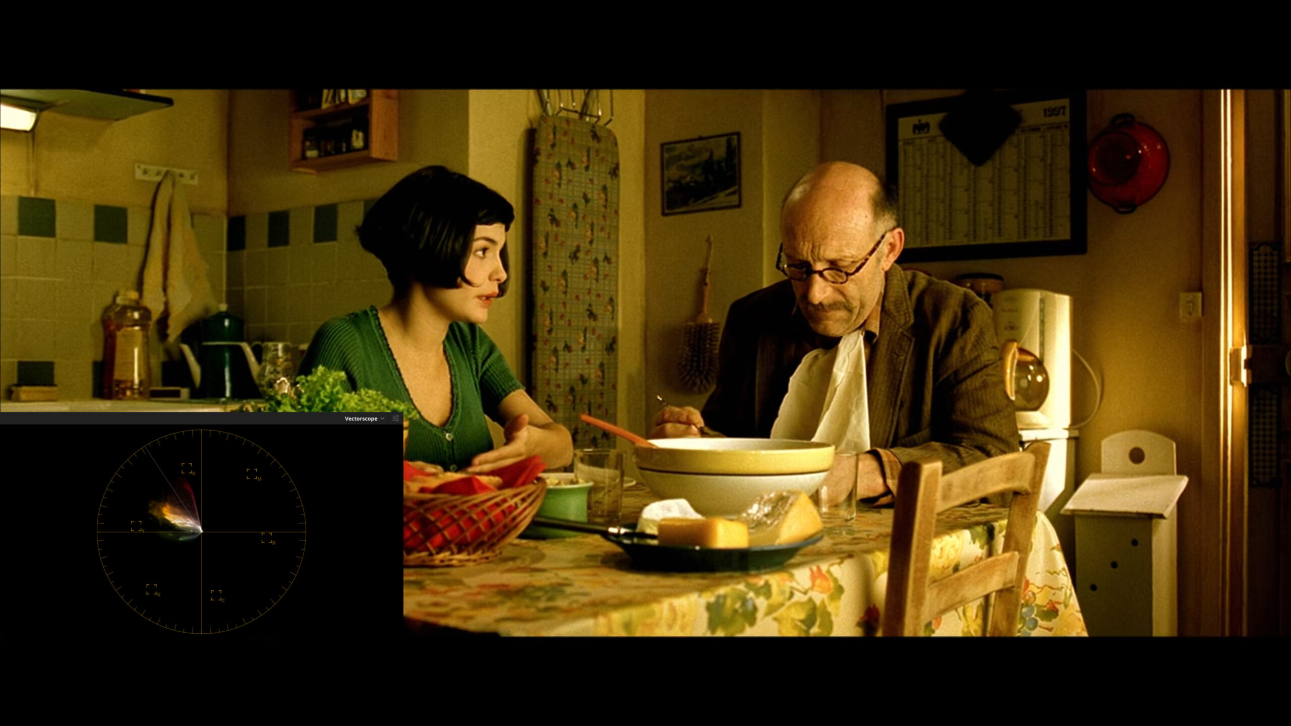
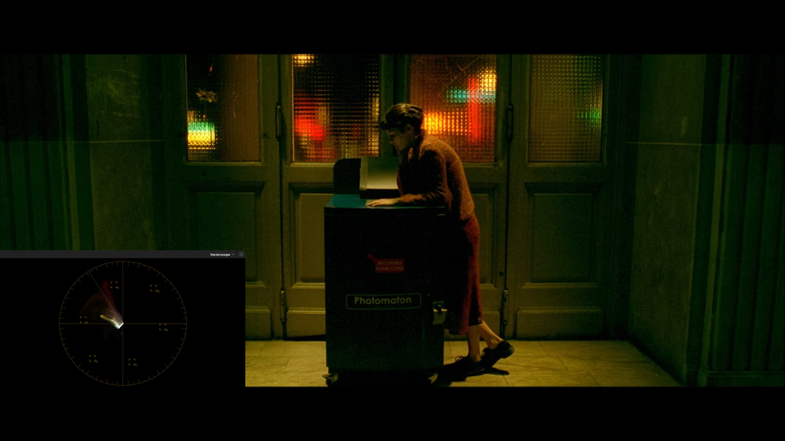
Elsewhere in the film there’s a warmer, more orange wash over the entire image and a splash of blue for some complementary colour contrast. See the blue lampshade on the vectorscope.
Isn’t colour grading just about making a picture that I like?
One of the great misconceptions about colour grading is it’s just pushing a picture around until you find something you like. There’s not really any good and bad, it’s all just personal taste. This is just flat out wrong.
I think of colour grading as about 60% technical and 40% creative. Before you can get creative, you need the knowledge, training and skills to get you to that 60% level. This is where you’re properly assessing tonal contrast, overall colour balance, skin tones, saturation and image depth.
Once you’ve mastered these technical aspects you can start to get creative with things like colour washes and tints, secondaries for hue and saturation changes, and power windows to sculpt the frame. But, without a perfect primary grade as a starting point, you’re just wasting your time.
What’s your colour philosophy?
Take your time and really try a lot of different options at the start of a session. Learn to use your scopes! Eyes get tricked easily and also get tired very quickly, so if you can’t use scopes, you’re flying blind.
When you’re just starting out, aim to spend most of your time in the Primary tab. It takes a lot of practice to get the perfect balance, so the more time you spend using lift, gamma and gain, the better! Think of your primary grade as your meat and potatoes, which is 90% of your meal. Everything else is just gravy.
Always look for depth in the frame and try to create imagery that immerses an audience. Also take lots of still and constantly A-B them. Ever get the feeling that you’re inside a movie. The perfect primary grade creates the image depth that helps draws an audience in. While it’s tempting to keep just adding node after node, a lot of the time, less is actually more. A single node with a good primary balance is sometimes all you need.
While less common than it used to be, you still unfortunately see a lot of flat, desaturated images with elevated midtones. The look isn’t based on any sort of reality and it’s also incredibly aesthetically unappealing. It’s people not knowing how to grade modern log cameras that capture an enormous dynamic range. Just as a creative DOP uses lens choice, composition and lighting to create depth, the colourist has to utilise tonal contrast and colour contrast to create the illusion of three-dimensional space.
Do I know if I have good colour vision?
Everyone perceives colour differently and if you work in the game for a while you’re bound to encounter people who are unaware of their colour vision deficiency. So, for your own peace of mind, it’s important to understand how accurately you actually perceive colour.
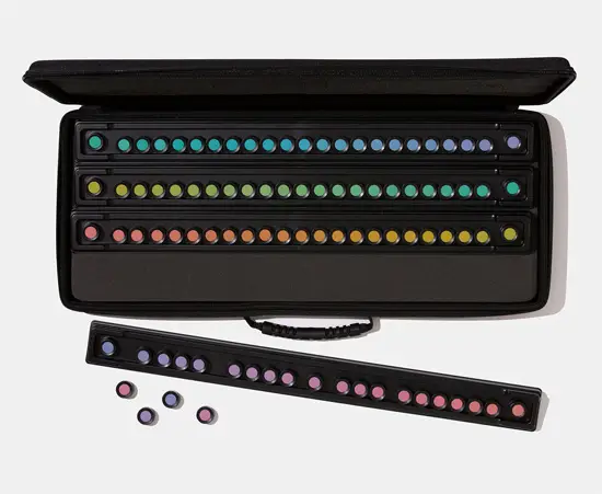
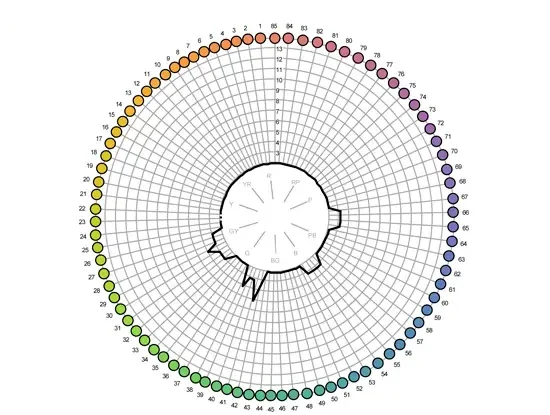
I can conduct the Farnsworth-Munsell 100 Hue Test, which has been a global standard for more than 60 years for evaluating an individual’s ability to discern colour. It consists of four trays containing a total of 85 removable colour reference caps spanning the visible spectrum. Colour vision aptitude is determined by your ability to place the colour caps in order of hue. If you achieve a superior score you can be confident that your colour vision is suitable for high-end colour grading tasks.
Am I’m looking at the right colours?
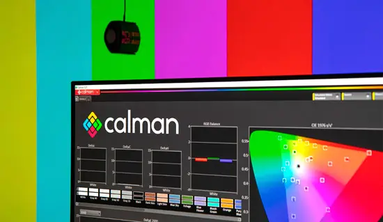
If you’re doing colour grading it’s critical to use a properly calibrated display. If not, you’re just wasting your time. You can bring your laptop or desktop display and I’ll take you through the steps of creating a 3D LUT and loading it into Resolve.
What about other resources?
You should definitely purchase the Color Correction Handbook. Also see Blain Brown’s Cinematography: Theory and Practice, for brilliant explanations of raw, log and setting exposure. For a discussion on the use of colour in film, see Patti Bellantoni’s If It’s Purple, Someone’s Gonna Die. Finally, I’m a bit of a film buff, so here’s a selection of some movies and TV shows you might have missed.
